Rebranding
Taking an idea someone already has — a concept, a logo, a business they love — and making it clearer, more current, and unmistakably theirs.
A brand should grow with the business behind it. When a logo starts to feel dated — or a company changes, grows, or wants to be taken more seriously — a thoughtful rebrand reconnects the visuals to who they really are now. My job is to listen for the vision underneath, then give it a form that’s professional, timeless, and clearly them.
A golf instructor who needed to stand out.
Robert came to me with a common problem: sales and online interest had stalled, and his brand was just a plain text handle — nothing that made him exciting or memorable in a very specific niche. He needed a visual identity that felt professional, current, and worth noticing.


Sketch, explore, refine.
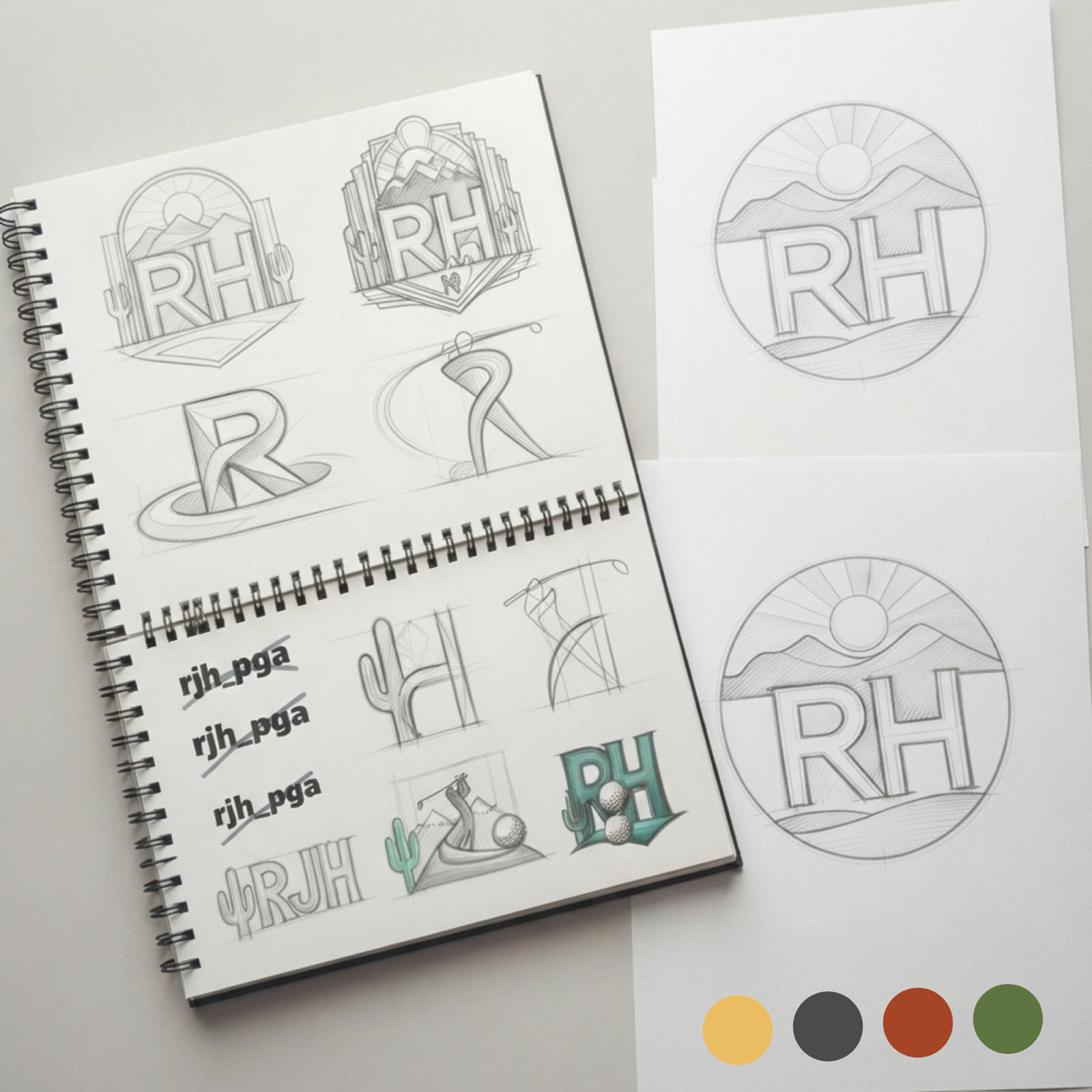
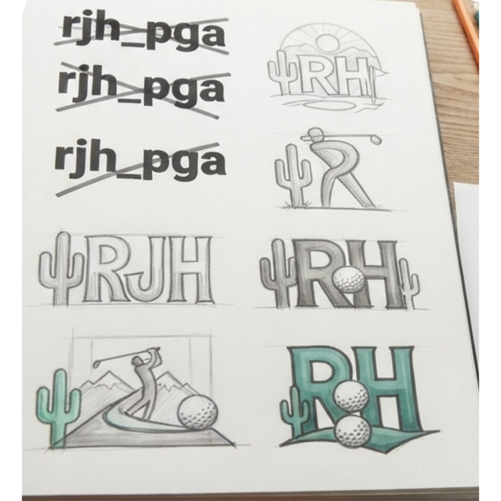
Every rebrand starts on paper. I sketched dozens of directions — monograms, badges, and type treatments — testing how an “RH” could feel athletic and premium without becoming a cliché.
From that exploration, a crest emerged: a desert landscape that places Robert exactly where he teaches.
Color with meaning.
The palette is drawn straight from Arizona and Robert’s favorite golf courses — warm desert gold, deep charcoal, clay-rust, and fairway green. Colors that feel like home to the people he teaches.
Every choice was documented in a brand guideline so the identity stays consistent everywhere it shows up.

Find the story
Start with what makes him different — his niche, his clients, and the places he loves.
Color from place
A desert-and-fairway palette pulled from Arizona and his favorite courses.
Timeless type
Type chosen to feel classic and enduring without losing a modern, clean edge.
The brand, out in the world.
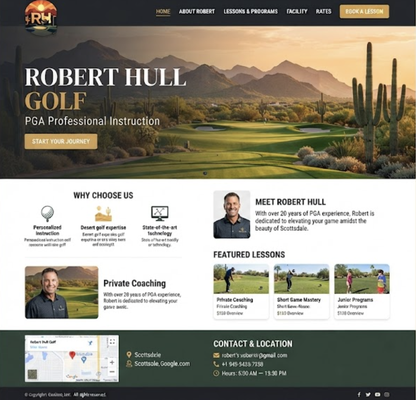
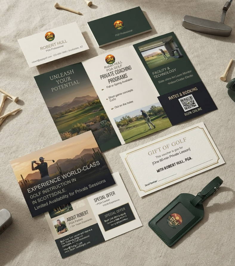
From the website to signage and stationery — one confident, consistent system.

Why a rebrand needs a rulebook.
A new logo is only the start. Without guidelines, a fresh brand drifts — the wrong color here, a stretched logo there — until it looks inconsistent again. So the rebrand shipped with a full brand guideline: logo usage, spacing, color values, typography, and voice. It keeps Robert’s identity sharp and unmistakable across his website, signage, printed materials, and every post to come.
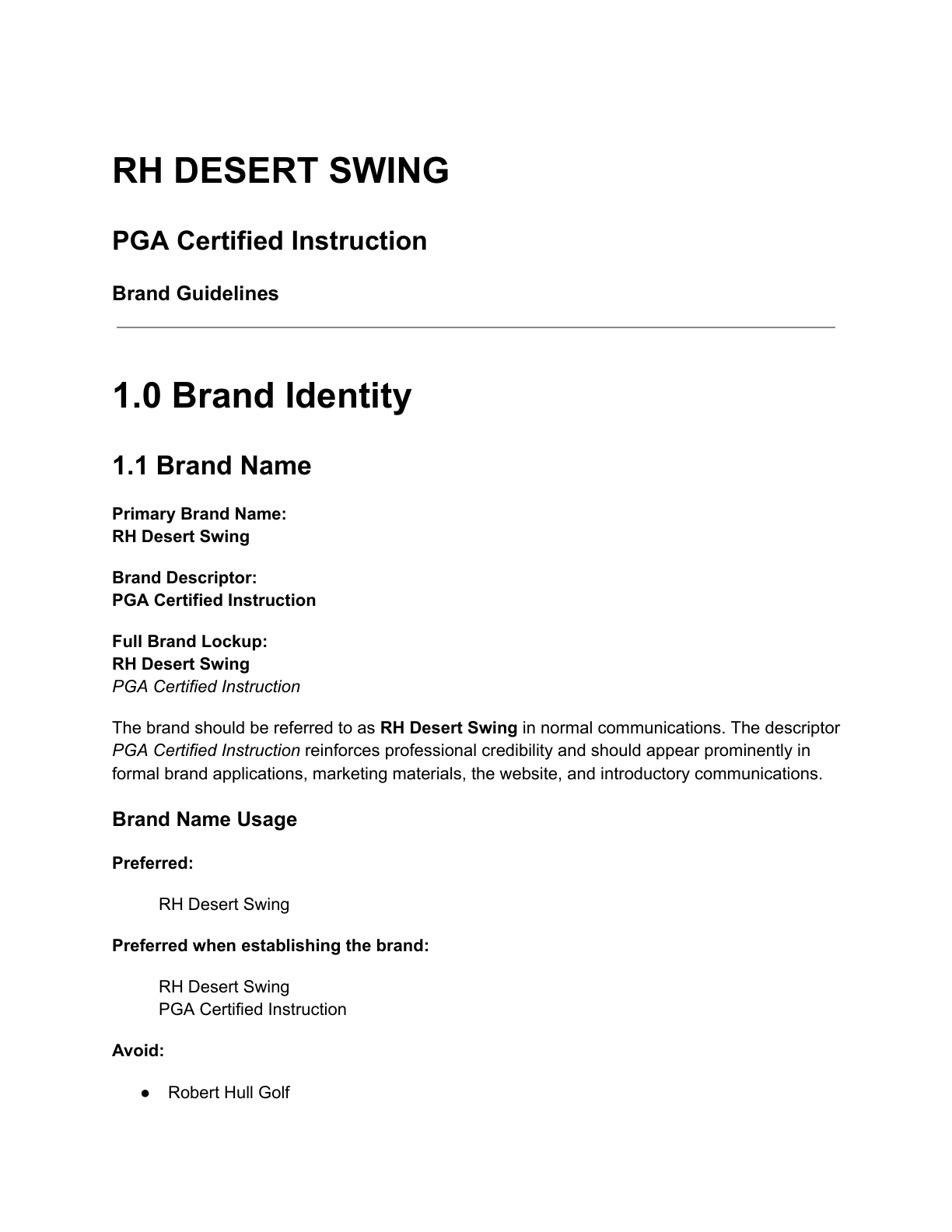
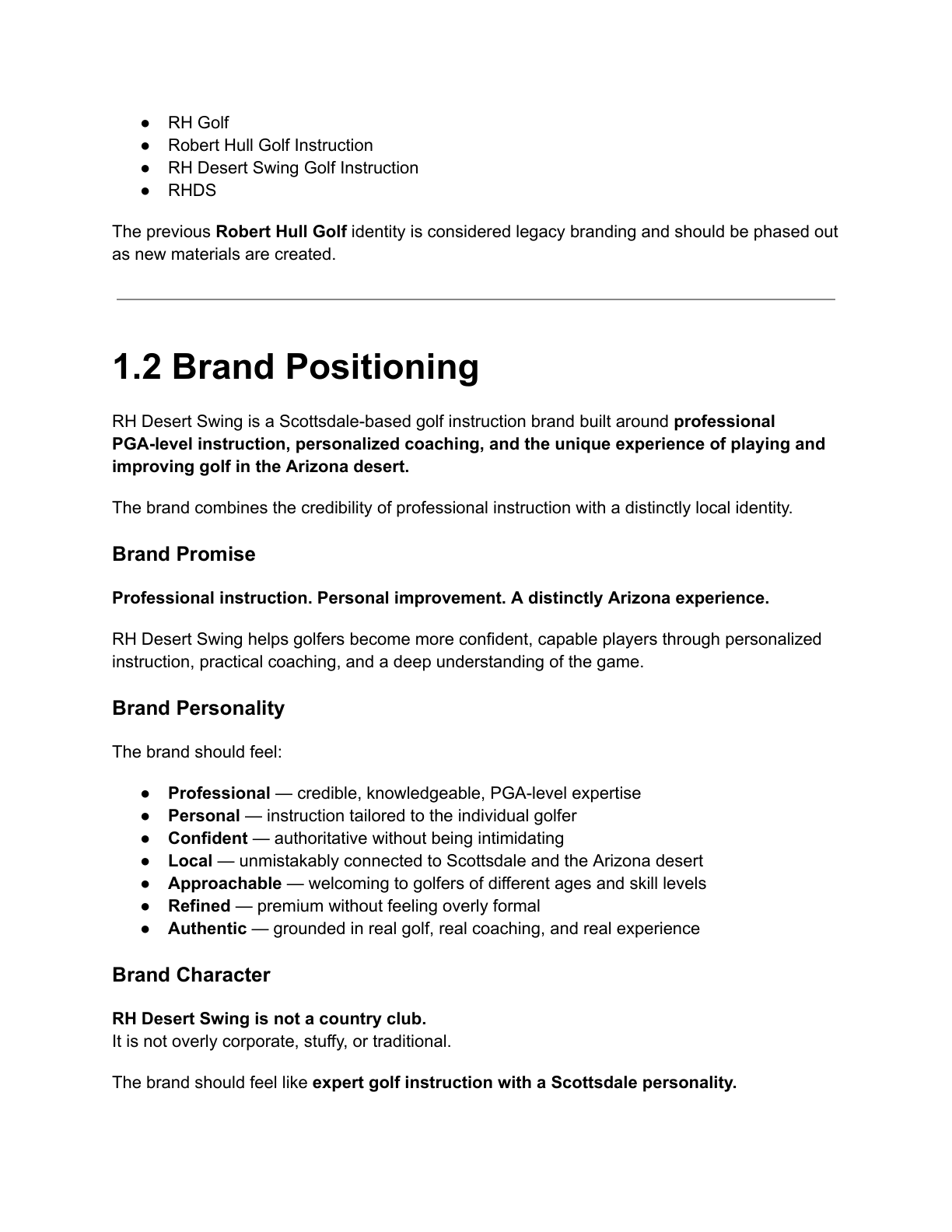
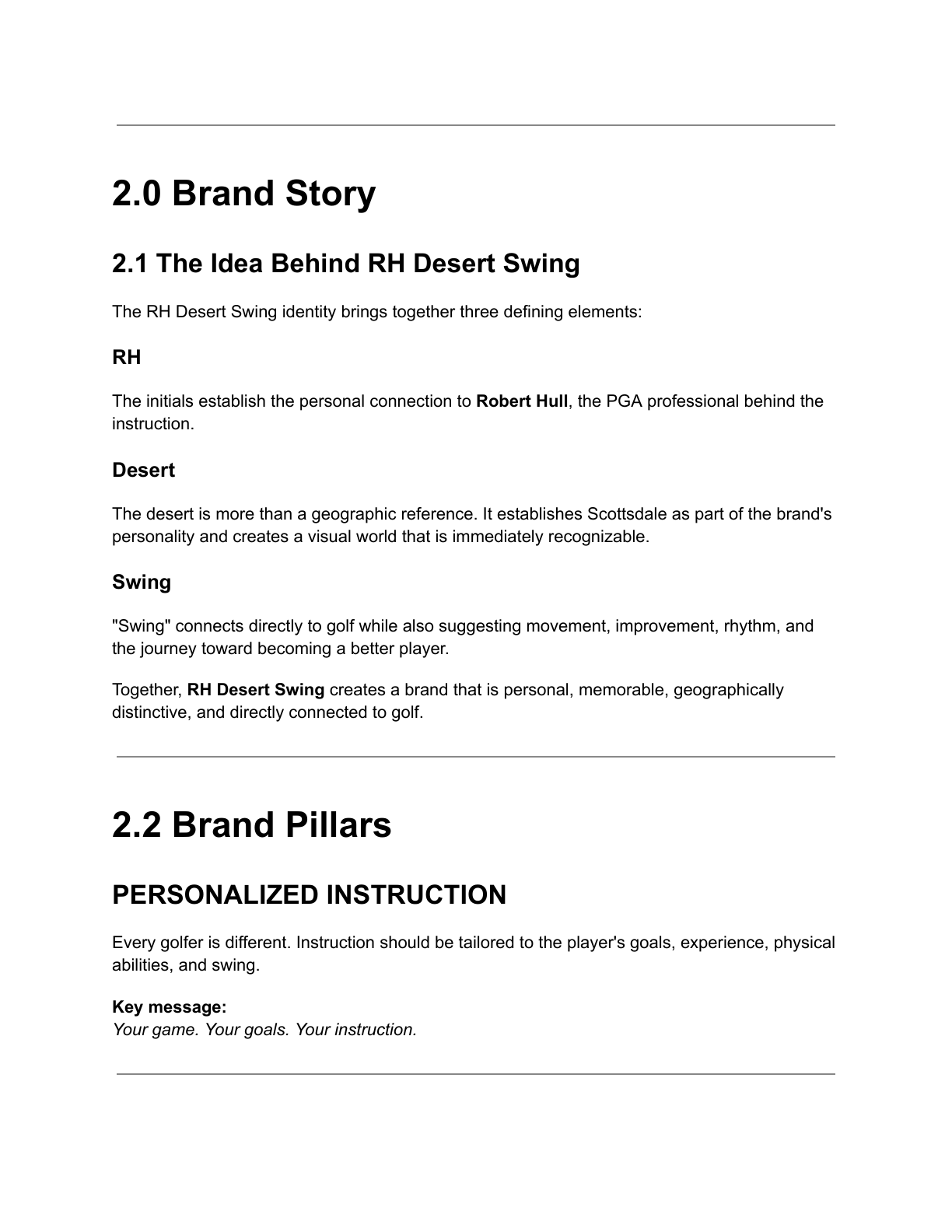
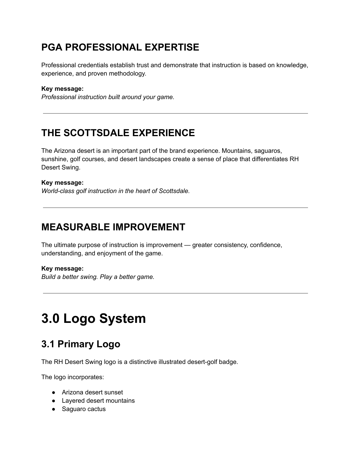
A 27-page brand guideline documenting logo, color, typography, and usage.
Why the refresh mattered
The new brand gives Robert something his old handle never did: a professional, memorable identity that matches the caliber of his instruction — and finally helps him stand out and get noticed online.
I’ve done this more than once
Two more brands I’ve shaped from concept to a confident, finished identity.


Is your brand starting to feel dated?
Let’s talk about a refresh that reconnects your visuals to where your business is now.